
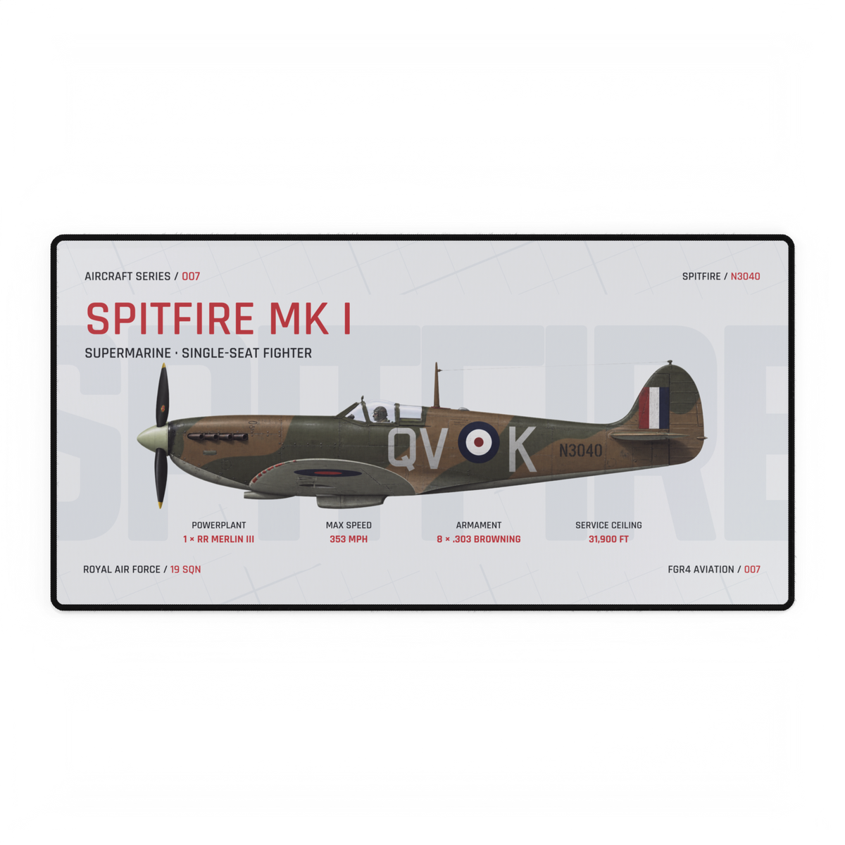
If you like an Aircraft Series design but cannot decide between Night and Studio, compare the background before you compare the aircraft. Both editions keep the same Spitfire side profile, technical layout and red accent colour. Night places them on deep charcoal; Studio moves them onto pale grey. That single change alters which part of the composition you notice first.
This guide uses the live Spitfire Aircraft Desk Mat as a controlled example. Both editions were available when checked, and their assigned images show the same Aircraft Series 007 composition. The comparison below describes only what is visible in those owned images.
The aircraft stays constant; the visual hierarchy changes
In both editions, the Spitfire runs horizontally through the centre. The title sits at the upper left, four technical callouts sit below the aircraft, and the red edition accents stay in the same places. The camouflage, markings and serial remain the subject.
The difference is the field around them. Night uses a dark graphite background, light main type and subdued oversized lettering. Studio uses a pale grey background, dark main type and a lighter oversized wordmark. The structure is constant, so the viewer can judge the effect of background value without a second layout changing the result.
| Check | Night Edition | Studio Edition |
|---|---|---|
| Background value | Deep charcoal | Pale grey |
| Main typography | Mostly light text | Mostly dark text |
| Aircraft edge | Lighter markings and canopy stand out against the field | Darker upper surfaces and outline read strongly against the field |
| Overall first read | Dark field with bright title and callouts | Light field with aircraft and dark title carrying more visual weight |
Neither treatment changes the subject. It changes the order in which the background, title, aircraft and callouts separate from one another. That is why the best choice is a composition decision rather than a claim that one edition is universally clearer.
Match the background to the job you want it to do
Start with the surface around the artwork. Against a black or charcoal desk, Night can continue the surrounding dark value so the red title, white markings and technical labels become the sharper breaks. Studio introduces a broad light rectangle, making the mat itself a more obvious change in value.
On a light desk, the relationship reverses. Studio can sit closer to the surrounding value, while Night creates the larger dark block. This is a simple comparison of adjacent light and dark areas, not a promise about how the product will look under every lamp or on every screen.
If you are judging online, remember that display brightness and print are different viewing conditions. The guide to aviation artwork on screen and in print explains why a digital preview is useful for composition but cannot reproduce every printed colour exactly.
Use four questions to choose
Place the two product images beside a photo of your desk. Decide whether you want the mat to continue the desk value or create a clear light-dark break.
Choose whether you want bright type on a dark field or dark type on a light field. Look at the title and callouts before the smaller details.
Ignore the aircraft for a moment and reduce each edition to its largest shape. The answer often becomes clearer when you judge the whole rectangle.
View both editions small. Pick the version whose aircraft, title and key labels remain easiest for you to separate at a glance.
The thumbnail test matters because large technical artwork contains several scales of information. The aircraft and title should read first; smaller specifications reward a closer look. Our article on line weight in technical aviation artwork explains how visual weight helps organise that reading order.
Compare editions before comparing aircraft
When several decisions arrive together, isolate them. First choose Night or Studio using one aircraft. Then compare aircraft within that edition. This keeps a background preference from being mistaken for a subject preference.
The same method helps when deciding between one focused profile and a wider line-up. The single-aircraft versus fleet artwork guide separates those two display jobs, while the guide to aircraft side, top and front views shows what a side profile reveals about an aircraft's proportions.
For the cleanest comparison, open the Spitfire product, switch between its available Night and Studio variants, and keep the aircraft fixed while you answer the four questions. Once the background choice is settled, browse the live Aircraft Series for the profile you want to lead the desk.
Product availability and owned imagery checked 7 October 2026. Hero image: owned FGR4 Spitfire Aircraft Desk Mat Studio Edition product image, showing Aircraft Series 007 with RAF Spitfire Mk I N3040. The comparison table and four-question card are editorial tools based on visible differences in the live Night and Studio product images.