
Line weight is one of the quiet reasons technical aviation artwork feels organised rather than crowded. A stronger line can establish the main subject; lighter lines can carry structure, dimensions or supporting marks. The difference helps your eye decide what to read first.
That principle comes from technical drawing, where lines are not interchangeable decoration. The practical lesson for an artwork buyer is simpler: look for a clear order between the aircraft, its supporting information and the background detail.
Aircraft drawings use more than one kind of line
The FAA’s current Aviation Maintenance Technician General Handbook explains that many aircraft drawings use thin, medium and thick widths. It also says different standardised line types identify boundaries, dimensions, hidden surfaces and centres; without those distinctions, the drawing would be hard to interpret.
NASA treats drawing conventions as formal requirements too. Its Kennedy Space Center engineering drawing manual sets conventions for aerospace and ground-support drawings based on the ASME Y14 series. An earlier Goddard engineering drawing standards manual makes the hierarchy especially concrete: visible outlines should be prominent, while hidden, centre, dimension and leader lines should be thinner.
Read technical-style artwork in three passes
The card below is an original FGR4 reading aid, not a universal engineering standard. It translates the source principles into a quick way to inspect aviation artwork.
Find the strongest boundary or dominant shape. It should tell you where the aircraft or main composition begins and ends.
Look for panel divisions, major components and other lines that explain the subject without competing with its outline.
Read labels, leaders, dimensions and background construction marks last. They should reward a closer look rather than take over the page.
Thickness and pattern do different jobs
A heavy continuous line and a fine dashed line differ in two ways: width changes emphasis, while pattern can change meaning. The FAA handbook describes centre lines as alternating long and short dashes, hidden lines as short evenly spaced dashes and visible outlines as solid lines representing the edges you can see.
That distinction matters when reading a real technical drawing. For decorative technical-style artwork, the safest approach is to treat dashed grids, leaders and construction marks as visual references unless the artwork identifies a formal drawing standard. A technical appearance alone does not turn an illustration into manufacturing or maintenance data.
Reduction is the real test
Line hierarchy has to survive more than one viewing size. An image can appear balanced at full resolution, then lose its finer marks when reduced to a product card or viewed from across a desk. NASA’s Goddard manual explicitly tells drawing makers to consider reproduction and reduction when selecting thinner line widths.
When comparing a listing, start at thumbnail size. If the aircraft and title remain clear, open the full image and inspect the supporting detail. Our guide to side, top and front aircraft views explains what each viewpoint can reveal, while the general-arrangement drawing guide shows why labels, units and dates still matter.
What to inspect on the F-22 product image
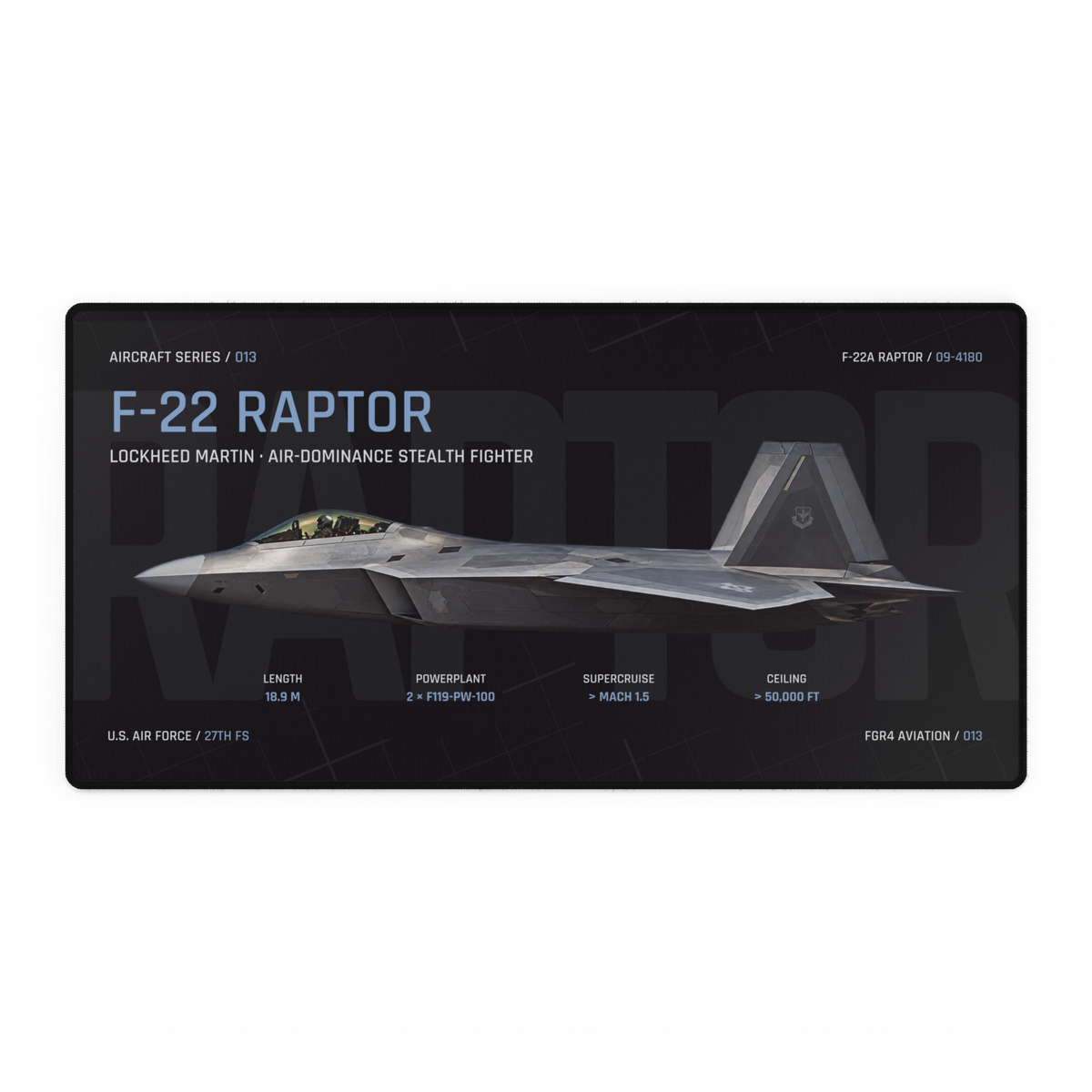
The owned hero above is a product mockup for the live F-22 Raptor Aircraft Desk Mat. It is useful here because it separates a large aircraft image and title from smaller specification blocks and subdued background construction marks. It is technical-style product artwork, not an engineering drawing and not evidence that the underlying aircraft image follows a formal drafting standard.
Read it in the same three passes: first the aircraft and large title, then the major information blocks, then the smaller labels and background marks. If you want to understand why the horizontal aircraft profile holds the centre of the composition, continue with our side-profile artwork guide.
Use line weight as a buying check
- At thumbnail size: can you identify the aircraft and main title without hunting?
- At full size: do the supporting marks add information or atmosphere without overpowering the subject?
- Across editions: does the hierarchy remain clear on both dark and light backgrounds?
- Before judging the print: remember that screen brightness and reproduction can change how fine details appear; our screen-versus-print guide explains that separate check.
Good line hierarchy gives you a clear entry point and more detail when you move closer. Use that order as you browse the live FGR4 Aircraft Series: identify the subject first, then decide whether the supporting technical language earns its place.
Sources and live product checked 2 October 2026. Hero image: owned FGR4 F-22 Raptor Night Edition product mockup. The three-pass card is an FGR4 editorial aid; product artwork is not a manufacturing or maintenance drawing.