
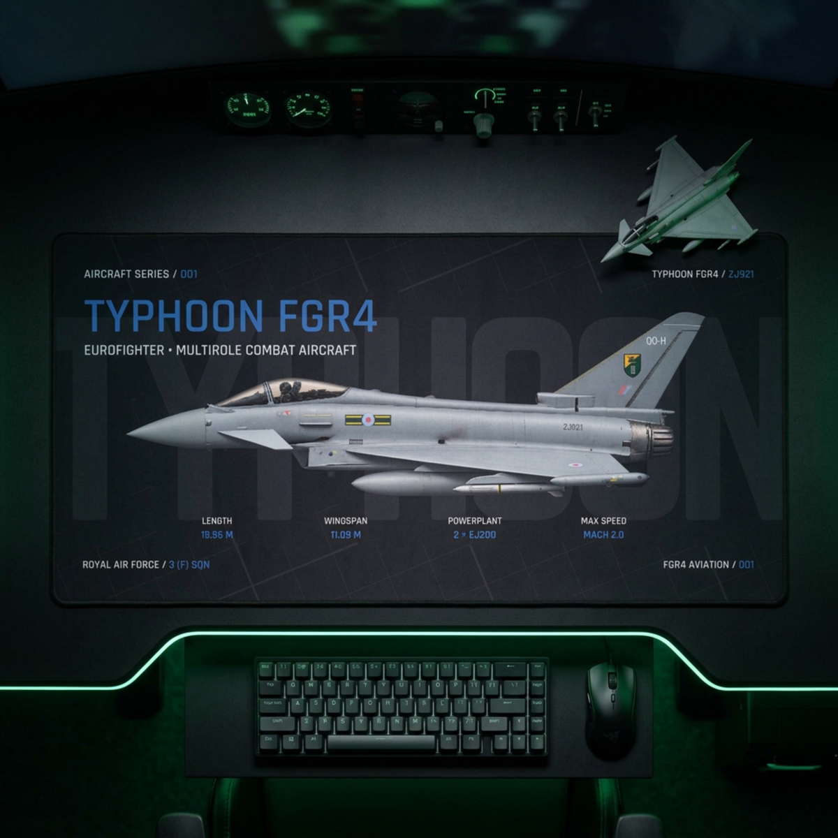
Aviation artwork can look brighter, cooler or more contrast-heavy on a screen than it does on a printed desk mat. The design has moved between different devices, a digital mockup and a physical surface, then into the lighting of your room. Treat the listing image as a useful preview of the subject and layout, not a calibrated sample of the final colour.
A screen and a printer do not interpret colour on their own
The International Color Consortium’s introduction to device profiles separates input devices, displays and output devices. Profiles give colour-management systems the information needed to transform colour data between a device’s native space and a device-independent reference.
That translation matters because the same numerical colour value does not explain how every display or print process will reproduce it. The ICC’s display-calibration guidance also explains that calibration and profiling work together to improve consistency between a screen and later outputs such as a print or projector.
A mockup is a representation, not a printed sample
Printify’s current mockup guidance says its digital renderings are representations rather than one-to-one guarantees, and that minor colour and placement differences can occur. Its colour-preview guide says RGB previews usually appear brighter and more vibrant, while a CMYK preview can give a closer—still approximate—idea of printed output.
This does not make a product image useless. It makes its job clearer: show the composition, subject, overall colour direction and available edition. Exact brightness and tone depend on the display, colour workflow, print process, material and viewing light.
Use a three-view colour check
Useful for: aircraft identity, composition, labels, broad palette and edition.
Do not assume: that your phone or monitor is a calibrated colour reference.
Useful for: spotting colours that may lose some screen brightness during reproduction.
Do not assume: that an on-screen CMYK simulation is the finished physical item.
Useful for: judging the actual surface, detail and colour in the room where you will use it.
Remember: daylight, warm lamps and cool LEDs can make the same printed surface appear different.
Compare the right product image first
The owned hero above is a product mockup for the current Typhoon FGR4 Aircraft Desk Mat. Its job is to show the Night Edition artwork in a dark desk setting. The same live product page also has a Studio Edition, which is an intentionally different light design rather than a promise that one physical print will switch appearance.
Before comparing colour, confirm the edition selected on the product page. Then compare the main product artwork with its lifestyle mockups. If the aircraft, labels and main blocks stay consistent while the surrounding scene changes, you are seeing how presentation and lighting frame the same design.
Brightness can hide or reveal the wrong detail
A bright display can make dark grey separation and blue accents feel more pronounced. A dim screen can close those tones together. Printify notes that some very bright colours visible on screens cannot be reproduced exactly in print, which is another reason to judge hierarchy and contrast as well as a single sampled hue.
For a different kind of visibility check, our Typhoon keyboard-coverage guide shows how equipment position changes which parts of the artwork remain visible. Colour and physical coverage are separate questions, but both affect the everyday view.
Make a practical decision without pretending to colour-proof
- Turn off any temporary night-shift or strong colour filter before comparing product images.
- Use the product artwork to judge subject, layout and edition before judging a precise shade.
- Look at more than one current product image; scene lighting can influence a lifestyle mockup.
- If exact physical colour is critical, treat a printed sample in your own lighting as the final reference.
Once the item is on your desk, use the handling instructions in our printed desk-mat care guide rather than experimenting with an unverified cleaning method that could affect the surface.
Choose the design, then expect a physical object
A product page should help you choose the aircraft, composition and edition you want. The finished mat will then exist under real room light on a textured surface, not inside an illuminated screen. Browse the live FGR4 Aircraft Series with that distinction in mind: compare the design system carefully, while allowing for the normal difference between a digital preview and a printed object.
Sources and live product checked 1 October 2026. Hero image: owned FGR4 Typhoon FGR4 product mockup. No physical sample test or exact colour-match claim is made.