
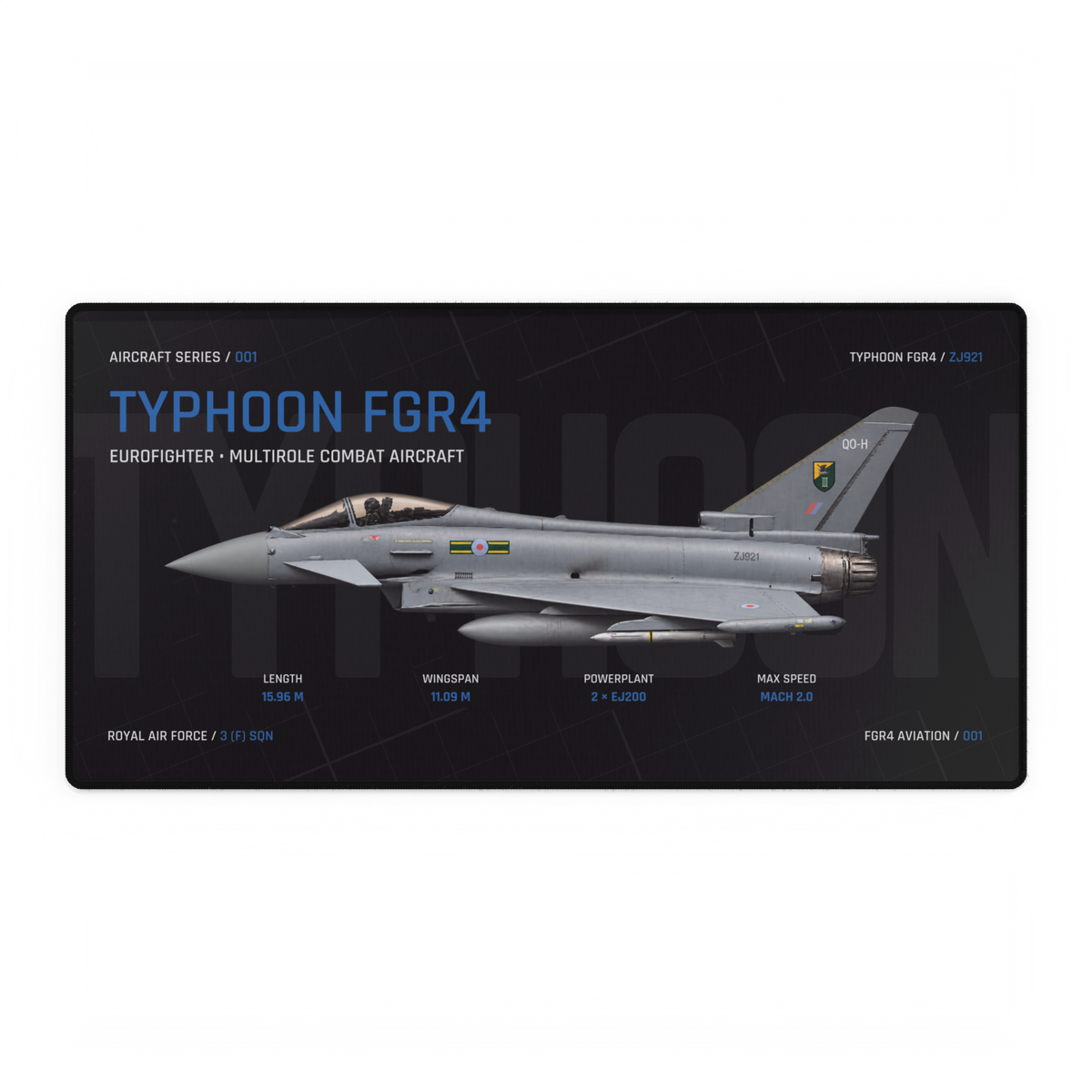
Aircraft artwork needs enough empty space for the silhouette to read clearly, for labels to sit without touching the subject, and for the design to survive a sensible crop. There is no universal percentage that makes those things happen. The useful test is whether every open area has a visible job.
In art vocabulary, that open area is usually called negative space. MoMA defines it as the empty area surrounding a shape or form and notes that it helps define the shape’s boundaries. In aviation artwork, the aircraft is the positive form; the sky, grid, colour field or plain background around it creates the negative space.
Empty does not mean unused
Negative space may contain colour, cloud texture or a faint grid and still function as open space. What matters is that it remains visually quieter than the aircraft, title or technical information it separates.
This is easiest to see around a wingtip, nose or tail. When a strong edge sits directly against the frame, the subject can feel clipped even if no part of the aircraft has technically been cut off. A quieter band between the outline and the frame lets the eye complete the shape before it meets the product edge.
Give the open area three jobs
A quieter field around the nose, wings and tail helps the full aircraft outline read as one form.
Titles, specification labels and series marks need their own clear zones rather than competing with the aircraft.
A margin around important details gives the composition room to handle product edges and modest card or screen crops.
These jobs give you a better question than “Is there enough blank background?” Ask what each open region separates or protects. If a large gap does neither, it may simply make the subject feel small. If every gap has been filled, the aircraft can lose its outline inside the information around it.
Map the subject before judging the space
Start by drawing the smallest rectangle that contains the aircraft. Do not include the title, labels or decorative background. Everything outside that subject box is the field available for hierarchy, information and crop tolerance.
This is an illustrative composition map, not a traced FGR4 product. The shape of the subject box changes with the view. A side profile produces a long, shallow box; a top view may need more height; a three-quarter aircraft can occupy both dimensions at once.
Compare two Typhoon compositions
The live Typhoon FGR4 Aircraft Desk Mat uses a long side-profile aircraft across the centre. In the inspected Night image, the main title sits in the upper-left field, the identification line sits upper-right, and four technical groups occupy the area below the aircraft. Dark gaps separate those elements from the airframe and from one another.
The current Eurofighter Typhoon Vector Desk Mat uses a larger three-quarter aircraft against a cloud field. The title and data form a block on the left while the aircraft fills much of the right. The cloud is not literally empty, but its softer texture can still act as the visual field around the harder aircraft edges and darker typography.
One composition is not automatically better. The side profile reserves structured zones for technical information. The three-quarter composition uses a fuller scene to create depth and movement. Both rely on contrast between the main subject and the area around it.
Do the three-distance test
Negative space should work at more than one viewing size. Test the complete image at three distances:
Shrink the image until the labels become secondary. Can you still find the aircraft immediately and read its overall direction?
Return to the size at which the product will normally be seen. Do the title, aircraft and labels form a clear order?
Inspect wingtips, nose, tail and small text. Are important edges comfortably inside the product boundary?
If the subject disappears at thumbnail size, the surrounding field may not separate it strongly enough. If normal viewing feels crowded, too many elements may be competing in the same zone. If the close view shows details pressed against the edge, the composition may need more protective margin.
Use a crop test, not a guess
Product grids, social previews and browser cards may show a slightly different window onto the same image. Test a modest crop from each edge while keeping the original aspect ratio visible as your reference. Do not crop the live product artwork itself; the exercise checks how well the composition tolerates different previews.
- Place guides just inside the top, bottom, left and right edges.
- Check whether the aircraft, title or series identifier is the first important element to meet a guide.
- Reduce the image to a thumbnail and repeat the check.
- Record which edge has the least tolerance instead of assuming every side is equal.
A crop-safe field is useful, but it should not shrink the aircraft until the subject loses impact. The aim is controlled tolerance around important elements, not the largest possible border.
Leave room for line weight and colour
Space does not work alone. Fine technical lines can disappear when reduced, even when their placement is generous. The FGR4 Intel guide to line weight in technical aviation artwork explains why the main silhouette needs stronger visual priority than smaller supporting marks.
Screen brightness can also make a dark gap or pale cloud area look different from the printed result. Use the screen-versus-print colour guide when checking whether the field still separates the subject after reproduction. Negative space only performs its job when the contrast remains visible.
Choose the composition by the job it does
Browse the Aircraft Series when you want to compare technical side-profile layouts with structured information zones. Open the Vector Series to compare larger three-quarter subjects inside atmospheric fields.
Look past the amount of “blank” area. Identify the aircraft’s subject box, then check whether the surrounding field defines the silhouette, organises the supporting information and protects the important edges. When those three jobs are clear, the negative space is working.
Source
Source and live product pages checked 17 October 2026. The FGR4 composition observations describe the inspected owned images; they do not claim access to the designer’s intent. FGR4 Aviation is not presented as affiliated with or endorsed by MoMA.