
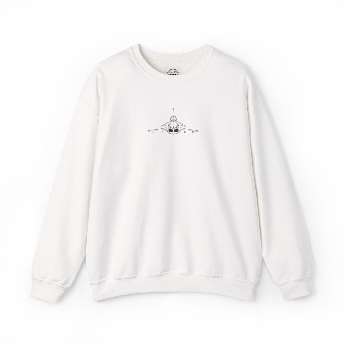
If you are choosing an aviation sweatshirt, the most useful first question is not “which aircraft do I like?” It is where do I want the main artwork to sit? A front graphic stays visible when you face someone or wear an open outer layer. A larger back print gives the design more room, while the front can remain restrained.
The current FGR4 sweatshirt range makes that choice easy to inspect because every listing includes front, back and folded mockups. Here is how to read those views before choosing a design.
Front print and back print solve different visual jobs
A front graphic is the part you can check without turning the garment around. It also occupies the area most likely to remain visible beneath an unfastened jacket or overshirt. Its impact depends on both placement and scale: a small centred aircraft mark reads differently from a wider chest graphic.
A back print has a larger uninterrupted panel to work with. In the live FGR4 Typhoon Out of My Way Sweatshirt, the front carries an FGR4 aircraft graphic while the rear carries the larger Typhoon-led design. The Head-On Typhoon version changes the front to a compact line-art aircraft view but keeps a larger graphic on the back.
That distinction matters: “front print” does not automatically mean loud, and “back print” does not mean the front is empty. These designs use both sides, but give each side a different role.
Use two axes: front visibility and back impact
The quickest comparison is to separate the decision into two axes. First, decide how much aircraft detail you want visible from the front. Then decide whether the back should carry the main visual statement.
Choose a smaller centred mark when you want the chest area to remain mostly open. Check the front mockup at full-garment scale.
Choose visible line art when the aircraft should be readable before the back graphic appears. Inspect the nose, wings and outline at listing size.
Choose a larger rear graphic when you want the back to carry the main artwork. Use the back mockup to judge its height and width.
Choose a front-and-back layout when both views matter, then decide which side should provide the first aircraft cue.
This matrix avoids a common mistake: judging a two-sided design from its first product image alone. The first image may show either the front or back, depending on the listing. Open the full gallery before comparing.
Three live layouts, three different front cues
The Typhoon Out of My Way layout places an FGR4 aircraft graphic on the front and the larger Typhoon composition on the back. The front identifies the aviation theme; the back carries the more expansive aircraft-led treatment.
The Head-On Typhoon Out of My Way layout brings the aircraft itself forward. Its front mockup shows a head-on Typhoon line drawing centred on the chest, while its back uses the larger Out of My Way treatment. If your decision turns on whether the aircraft is immediately visible from the front, compare this listing directly with the first design.
The FGR4 Graphic Logo Sweatshirt uses the same basic hierarchy in a different way: a smaller aircraft graphic on the front and an enlarged version across the back. It is a useful control in the comparison because the visual language remains consistent across both sides.
Check placement separately from artwork
It is easy to choose the illustration first and only notice its position later. Reverse the order for a cleaner decision:
- Look at the blank garment shape. Note how much clear fabric surrounds the graphic.
- Find the graphic centre. Check whether it sits high on the chest, centrally across the front or over the larger rear panel.
- Compare relative scale. Judge the print against the whole garment, not against a cropped detail.
- Check both sides together. Decide which view carries the main aircraft story.
This is a visual check, not a claim about how the garment will feel or fit. The live pages provide size options from S to 2XL, but placement should be judged from the supplied mockups and sizing should be checked against the current product information.
Try the outer-layer and chair-back checks
You can test the placement choice with clothes and furniture you already own. Put on an open jacket or overshirt and look at the visible chest area in a mirror. That gives you a practical boundary for the part of a front print likely to remain visible. It does not predict exact coverage, but it helps you decide whether a compact chest graphic or clearer centred aircraft suits the way you layer clothes.
Then hang the outer layer over a chair and look at the panel facing the room. A large back print becomes the primary view when the garment is seen from behind or draped over a chair. If that is the view you most want to read as aviation artwork, give the back mockup more weight in your choice.
Why the folded view matters
The folded image is not just a decorative extra. It shows how the graphic reads when only part of the garment is visible. On a shelf, in an open parcel or across the back of a chair, the full front and back are rarely presented as flat rectangles.
Use the folded view to check whether the main aircraft cue remains legible when the sleeves and lower body no longer frame it. Then return to the full front and back images before deciding; a folded crop cannot show the complete scale of either print.
A five-question choice before you buy
- Do I want the aircraft itself visible from the front?
- Should the front graphic feel compact or occupy more of the chest?
- Do I want the back to carry the largest artwork?
- Which print remains visible with the outer layers I already wear?
- Have I checked the front, back and folded images rather than judging the thumbnail?
If the answer to the first question is yes, start with the head-on Typhoon design. If the front should act as a quieter introduction while the rear carries the main graphic, compare the standard Typhoon and FGR4 graphic layouts. The point is not that one placement is universally better; it is that each gives the artwork a different visual hierarchy.
For another way to choose an aviation design, the guide to aviation gifts beyond model aircraft separates useful formats by where and how they will be seen. If you are comparing desk or wall formats instead, use the wall-or-desk artwork guide.
Compare all three views, then choose the hierarchy
A front graphic is best judged by what remains visible from the front. A back print is best judged by how much of the rear panel it uses. A two-sided aviation sweatshirt asks you to choose which view should introduce the aircraft and which should carry the main statement.
Open the FGR4 Sweatshirts collection, compare each full front, back and folded gallery, and choose the placement hierarchy that matches how you want the artwork to appear.
Sources
- FGR4 Typhoon Out of My Way Sweatshirt
- FGR4 Head-On Typhoon Out of My Way Sweatshirt
- FGR4 Graphic Logo Sweatshirt
- FGR4 Sweatshirts collection
Product pages, current options and owned gallery images checked 14 October 2026. Mockups show the listed designs; this guide does not claim first-hand wear testing.