
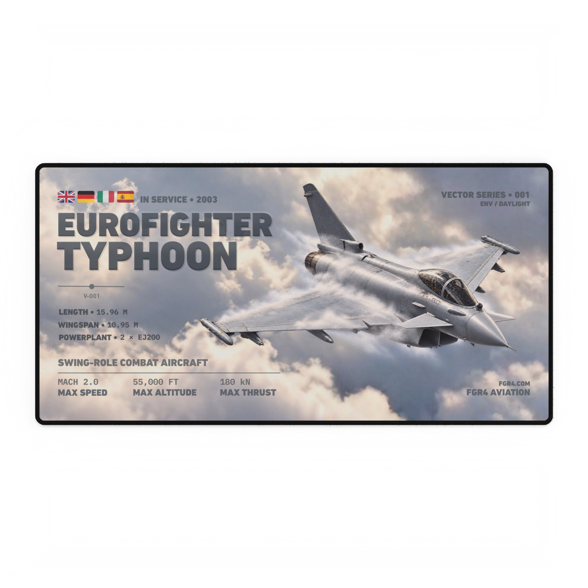
Static aircraft artwork can feel fast without pretending to be a photograph of speed. The effect comes from composition: a strong diagonal sets a direction, scale makes the aircraft command the frame, overlap creates depth and repeated marks keep the eye moving across the image.
Those choices do not prove how fast an aircraft is flying, and they do not reveal the artist’s undocumented process. They explain what is visible on the finished page. Once you can separate the layers, you can judge whether an aviation design feels active, calm or simply crowded.
Start with the dominant angle
The National Gallery of Art’s guide to line explains that artists use diagonal lines to convey energy and movement and to lead a viewer into a picture. The image remains fixed; the line creates a direction for reading it.
That is the first check for aircraft artwork. A level side profile reads clearly and steadily because the fuselage often follows the horizontal edge of the frame. Turn the aircraft onto a diagonal and the nose and tail establish a route across the page. The design gains a direction rather than sitting parallel to its border.
The angle only needs to be readable. A steep bank is not automatically better, and a diagonal should not distort the aircraft. Ask whether you can trace one dominant line from tail to nose without the background pulling you in several competing directions.
Scale decides whether the aircraft leads
A large aircraft shape carries more visual weight than a small one surrounded by empty background. Bringing the subject close to the frame can also make the composition feel immediate: the aircraft occupies the viewer’s space instead of becoming one distant object in a wide scene.
Scale should still leave enough room to identify the type. If wingtips, nose or tail meet the edge, the crop needs to feel deliberate rather than accidental. If every part is given generous space, the result may feel calmer. Neither treatment is wrong; the useful question is whether the chosen scale supports the intended energy.
Our guide to aircraft side, top and front views explains what each viewpoint reveals. Motion-led artwork often uses a three-quarter view because the fuselage, wings and depth axis can all contribute to the composition, while a side view is usually stronger for direct comparison and identification.
Overlap turns a flat page into layers
The J. Paul Getty Museum’s foreground-to-background lesson identifies overlapping and relative size as tools for creating the illusion of spatial depth. One form covering part of another tells us which appears closer, even on a flat surface.
In aircraft artwork, the aircraft can overlap the cloud field, technical lines and atmospheric marks while remaining separate from the title and data. That distinction matters. Overlap builds foreground, middle ground and background; collision makes two important elements fight for legibility.
Look at the edges. A clear silhouette against a quieter patch of cloud keeps the aircraft readable. A pale streak passing partly across a wing can integrate it with the atmosphere. If every edge has the same contrast and every layer is equally sharp, the design may lose depth because nothing appears to sit in front of anything else.
Repeated marks carry the direction through the frame
Cloud bands, vapour-like streaks, grid lines and small technical rules can reinforce the main aircraft angle. They act as secondary routes: the eye meets a mark, follows it towards the aircraft and continues through the nose or wing.
The important word is reinforce. Background marks should support the main direction rather than create a second, unrelated one. Repetition also needs variation. Identical lines spaced like a pattern can feel decorative; changes in length, softness and spacing can create a stronger sense of depth.
Line weight helps keep that hierarchy intact. The FGR4 guide to line weight in technical aviation artwork shows why major outlines, secondary structure and fine detail should not all demand equal attention.
Trace the strongest diagonal from tail to nose. It should give the composition one readable route.
Check whether the aircraft leads the frame while retaining enough shape for accurate recognition.
Separate foreground aircraft, middle-ground atmosphere and quieter background through overlap and contrast.
Follow repeated cloud, streak or technical marks and ask whether they strengthen the main direction.
This card is an editorial reading tool, not a claim about aerodynamic flow, actual aircraft speed or a specific designer’s intention.
Use the still-frame test
Cover the title and aircraft name, then look at the image for a few seconds. Ask four questions:
- Where does the strongest angle begin and end? If you cannot find one, the composition may feel static or divided.
- Which element appears closest? The aircraft should separate clearly from the atmospheric and technical layers around it.
- Does your attention have somewhere to go? The nose, wing or background marks should continue the route rather than stop it abruptly.
- Does the type remain readable? Energy should not come at the cost of a broken silhouette or hidden identifying features.
Then restore the typography. The title, specifications and branding should sit inside the same hierarchy rather than starting a second composition. Our screen-versus-print guide explains why contrast seen on a bright display should not be treated as proof of the final printed result.
Read the motion layers in the owned Typhoon artwork
The owned hero above shows the live Eurofighter Typhoon Vector Desk Mat in its Daylight Edition. The aircraft forms a long diagonal from the raised tail towards the lower-right nose. Its large three-quarter view overlaps the layered cloud field, while white atmospheric marks follow parts of the fuselage and wings. The title remains in a separate block on the left, giving the aircraft room to lead the right half of the frame.
Those are observations about the visible composition. The white marks are treated here as graphic and atmospheric elements, not evidence of a particular manoeuvre or airflow condition. The product and its single Daylight variant were available when checked for this article.
Browse the live Vector Series to compare how six aircraft shapes behave inside the same Daylight format. If you are choosing between one aircraft and a wider line-up, the single-aircraft versus fleet guide separates those two display jobs.
A sense of motion is strongest when the layers agree. The aircraft supplies the dominant angle, its scale sets the visual weight, overlap creates depth and secondary marks extend the direction. Read those four decisions separately and a dynamic aviation composition becomes much easier to assess.
Sources and product availability checked 10 October 2026. Visual-design basis: National Gallery of Art material on diagonal lines and J. Paul Getty Museum education material on foreground, background, overlap and relative scale. Hero image: owned FGR4 Eurofighter Typhoon Vector Desk Mat Daylight Edition artwork, inspected at full resolution. The four-layer card and still-frame test are editorial analysis tools, not aerodynamic or production records.